Telling A Visual Story Through Light and Shadow
WHAT IS YOUR STORY?
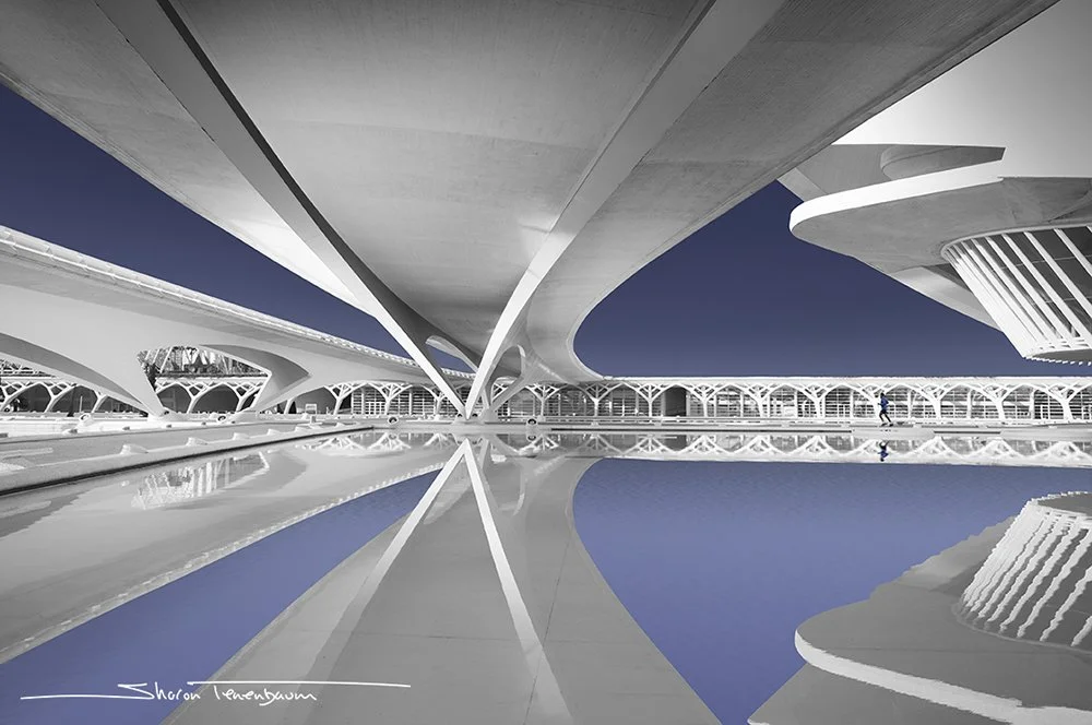
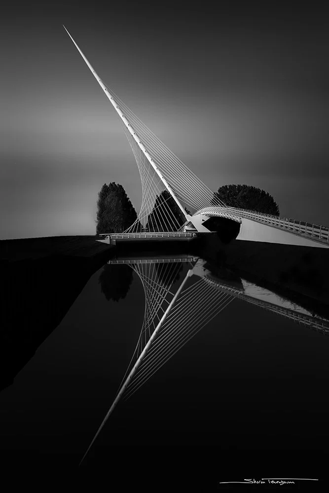
We are all familiar with the literary stories, of which there are many genres. From the most elaborate, descriptive novel to the vague and elusive poetry. We can relate to these ‘stories’ as they portray a human condition or situation the author decides to share with us. The words chosen to tell this story are carefully selected and are the stone and the chisel that create a sculpture. The words on the page are the material (stone) and the words that the author carefully eliminated are the chisel. In photography, the camera does not know what story your mind’s eye sees in a specific scene. It captures the relevant and irrelevant details without any curation. It is the task of the artistic photographer to continue the visual storytelling by enhancing the image in a way beyond the camera’s limitations and chiseling away the irrelevant details that are not contributing to the story.There are many ways in which a photographer can enhance the image to convey the story they want to tell. A few are listed below:1. Framing and Composition2. Time (long exposure vs. a short exposure)3. Black and White vs. the use of Color4. Perspective5. Tonal Range – large or narrow, this will determine the contrast in your image and define which of the subjects in your frame you want to give center stage by brightening or darkening (dodging and burning).Nobody can say that any one of these attributes is more important than the other. They all contribute to the narrative in their own essential way. In this series of articles, I will be exploring each one of these contributing elements and how they affect the narrative of the visual story. In this article, I will elaborate on the last one, tonal range. How the tonal range you choose for your image will contribute to the story you are trying to tell.I will first address tonal range in black and white images, as I believe it will exemplify my point more clearly. The human eye does not see in black and white. When we look at a photograph that lacks color, it looks more artistic to us, mainly, because it distorts the way we see reality. You could also claim that it looks artistic as photography started in black and white, which certainly contributes a fair share as well, however, I would argue that the latter is a minor factor compared to the former.A black and white photograph removes us from reality a step further. All photographs flatten our three-dimensional reality to only two. We lose the sense of depth that helps us to grasp the environment around us. So a black and white photograph has two levels of separation from reality as we experience it.My intention with the images below was to celebrate the geometry of the Sundial Bridge in Redding, California. I wanted to accentuate the lines, curves and most importantly, the depth. The ‘story’ I wanted to tell was all about form and light. A simple conversion to black and white did not quite accomplish my task. I needed to take it further by adding an ‘umph’, a wow factor that would not only increase the contrast, but also transform the image from a flat, mediocre, two-dimensional image to one in which the viewer can feel immersed in the geometry of the bridge.I use Photoshop extensively to post-process my images. I believe that an image is comprised of three factors: 1) Pre-Visualization of what you want your image to look like before you even take the shot. This is the reason that made you pick up the camera in the first place. What was it about the scene that grabbed you? 2) In camera composition - make sure that your composition includes the elements contributing to your story.3) Post-processing to finish off conveying your vision. A huge element of my vision was the play of light. Just as a sundial uses light to tell the time, my images needed to emphasize and convey light.Conveying depth through the use of light and shadow (tonal range) is nothing new in the world of art.Conveying depth through the use of light and shadow (tonal range) is nothing new in the world of art.However, as you learn to draw, you are taught about the relationship of light and shadow in creating volume, transforming a two-dimensional circle into a three-dimensional sphere. By gradually changing the variation of light and shadow, depth is created.I apply the same methodology to images in which I wish to add volume. You can see it very clearly in Sundial #1. The pilon takes on a look of a three-dimensional cone rather than a flat panel. In Sundial #2, the play of light leads you along the bridge deck to peak at the far side and guides your eyes beyond the leading lines. The eye wants to go to the bright parts of the image first. If you create a gradual change of light, you are deciding where you want to guide your viewers to look - just like a leading line, but by using light and shadow as your guides. In Sundial #3, the gradation of light is used to accentuate contrast as well as depth.If you follow my teachings, you will know that I constantly preach the concept that art distorts reality, so why, you may ask, am I trying to emulate reality in these images? The answer is twofold. Firstly, we expect to see in a photograph a two-dimensional depiction of a scene. We don’t expect a three-dimensional representation. That unexpected depiction throws us off and creates a ‘wow’ factor. Secondly, and this I find especially true to architectural photography, adding depth to a scene helps in ‘humanizing it’. Architectural photography, without people in the scene is about structures - concrete, wood, steel and all other inanimate. The depth helps in ‘warming’ the scene, and makes us ‘feel’ that we can walk into it and ‘feel’ the experience of seeing it ourselves.This technique is applicable beyond black and white images. Even though I would strongly argue that black and white images have a wider tonal range, we can still create depth with color images. Notice the gradation of tone in the blue parts of the image. The blue tones transition from dark on the perimeters to lighter shade of blue to draw the eye into the image, as do the leading lines of the underpass. This can easily be achieved by darkening or brightening the colored areas.Valencia City of Arts and Science Underpass
Sometimes the perspective of our composition doesn’t lend itself to the same gradient lighting as described above. In the image of the Lyre Bridge, the story I wanted to tell was ‘the elegant and gentle lines of the bridge’. A bridge, strong and stable yet so graceful and gentle. I needed to make the bridge stand out from the background. Contrast was my friend here. By isolating the bridge elements (pylon and cables) and then increasing their contrast, I managed to visually convey the story of my mind’s eye.Lyre Bridge - Exemplifying extreme contrast to increase drama and presence
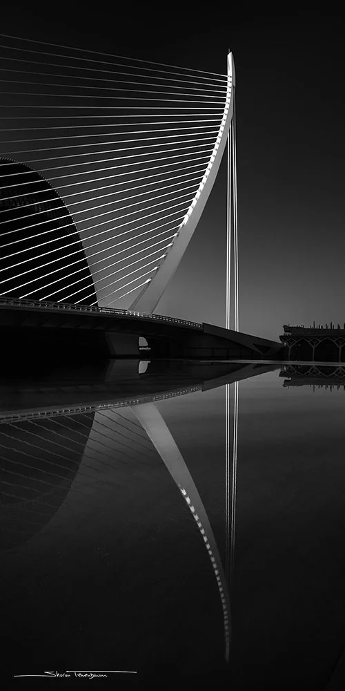
Valencia - Assut de l'Or Bridge
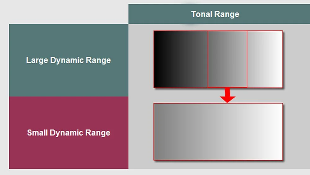
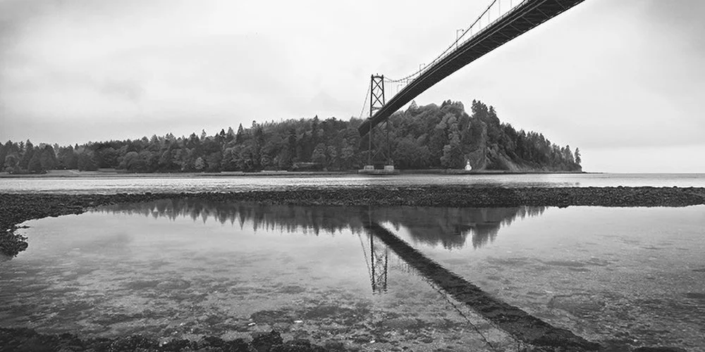
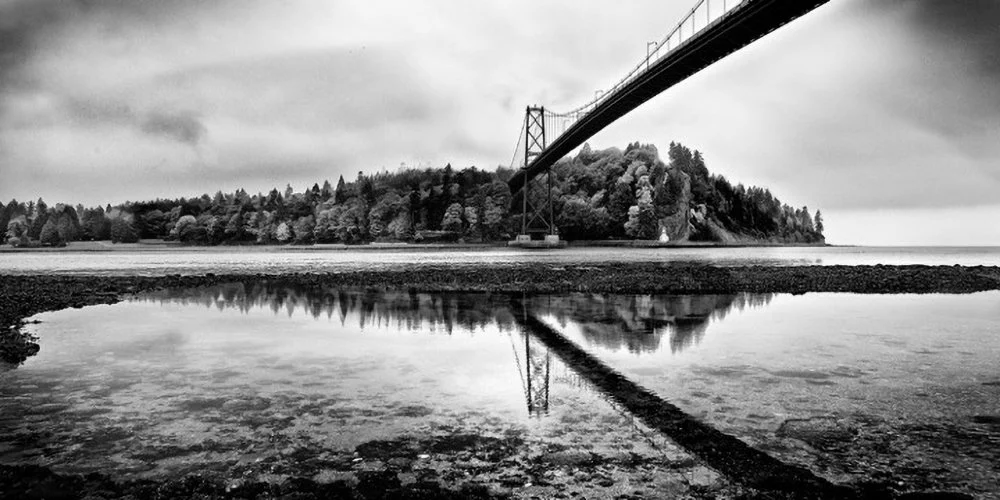
The image below demonstrates the concept of a Large and Small Tonal Range. A large dynamic range includes all the tones from pure black to pure white, whereas a small dynamic range does not include the extreme tones of pure black and pure white. It only includes a portion of the full spectrum tone.The two images below, strongly exemplify the power of contrast and a wide tonal range in black and white to increase drama and excitement into the scene:Simple black and white conversion. Image tone is flat and emotionless,
Strong contrast help in conveying a stronger emotion.
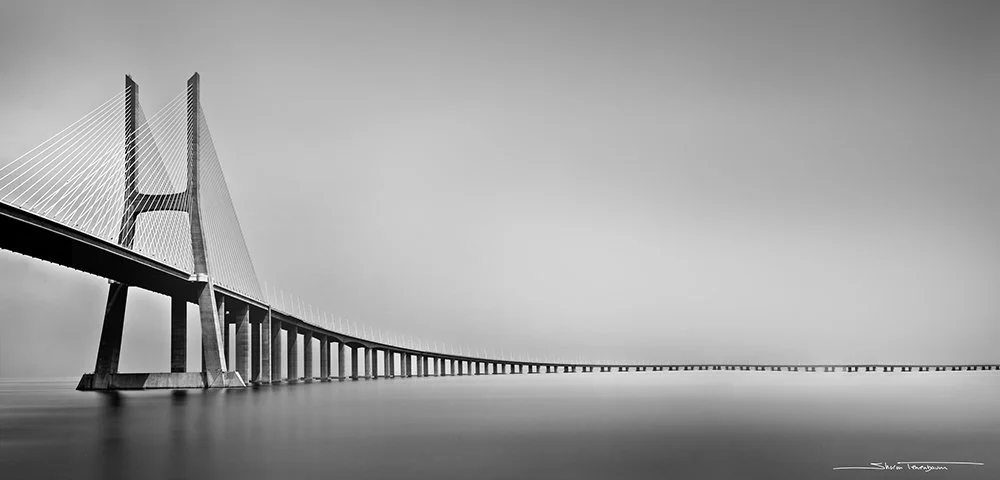
Extreme contrast of tone will create a strong feel of drama – a visual statement if you will. Sometimes I want to convey a more quiet and tender feeling. So, in contrast, in the Vasco da Gama bridge, the narrow black and white tonal range creates a calmer feeling. Nothing in the image is at its extreme, nothing is shouting at you. A beautiful example of when a whisper is louder than a shout.Vasco da gama Bridge
Fremont Bridge – Portland Oregon
It is important to remember that there is no right or wrong amount of tonal range. You as the artist/photographer, first need to decide what your story is. What do you want your image to convey? Then use tonal range as a tool to help tell your visual story.


